League of Angels III – an interactive (weak) video
My previous text about League of Angels III was a list of first impressions of the game. Frankly speaking, having spent more time on this game, there is not much more I can add. Auto-tracking makes it so that no matter how much time we spend on the production we still don’t know what we’re really doing in it. Auto-tracking in itself is not necessarily a bad solution – Lord of Dragons is also based on auto-tracking, but it can be a much more engaging game. Gameplay is as dull as an oil slick, and almost every aspect of the game is very badly done, and the reason for this is one mistake of the developers.
I think the main problem with League of Angels, which affects other aspects of the game, is that it progresses too quickly. Before we know it, we already have 30th level of experience, many unlocked skills, upgraded mount and a few heroes which we command during the fight. For example: as we gain the next level of experience, we “highlight” the so called “enemies”. “Constellations” that increase our stats. The progression of our hero is so fast that we completely forget about this activity, but when it comes down to it, we spend a good few minutes clicking through the backlog of stars. When we start the game, we are not given the opportunity to create our own character or even give our own nickname! We can only choose the gender of the protagonist. What an enjoyable and engaging game, isn’t it?
Interactive

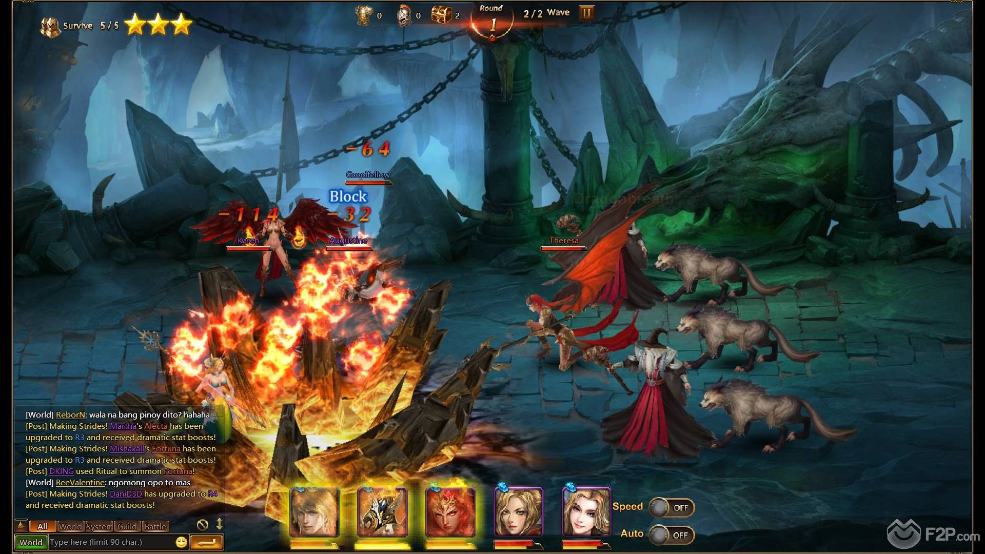
The game leads us by the hand as if we were a small child. On top of that, most of our time in the game is spent fighting off the constantly popping and frustrating notifications that inform us of newly received rewards, items, and upgrades. During these torments we are supposed to feel the “free” nature of the game and the generosity of its creators. Free Jokes. Soon it turns out that we have to open the wallet if we want to complete some quests, which in a way force us to open lootboxes. The interface is painfully unreadable and at first glance you can see what the game is about. You can see it in the screenshot below.
Along with each level there are more and more highlighted options and upgrades, as a result, over time we do not know what we really upgrade, or what these upgrades give us – there are too many of them and they appear too often. Progress in the game can be accelerated not only with the help of micropayments, but also thanks to the built-in option to accelerate fights.
While we are on the subject of battles, they are also automatic and do not require any intervention from the player except for the use of useless skills of heroes, unless you turn on the manual mode. It won’t surprise anyone if I say that in manual mode combat is also just as boring. It is quite convenient that you can move your heroes directly by clicking on the battlefield, or using a small tactical map in the corner of the screen. In combat, we are accompanied by recruited heroes, of which we can have up to five. They differ in classes. We can choose between healer, tank or fighter.
In conclusion I will (unfortunately) repeat the words from my previous text. The only definite plus of LoA III is the visuals. It is rare to find 3D browser games that are so pleasing to the eye. Unfortunately, the setting alone will not help this game enter the category of even middle games.

